Branding for
getvoila plates
getvoila plates
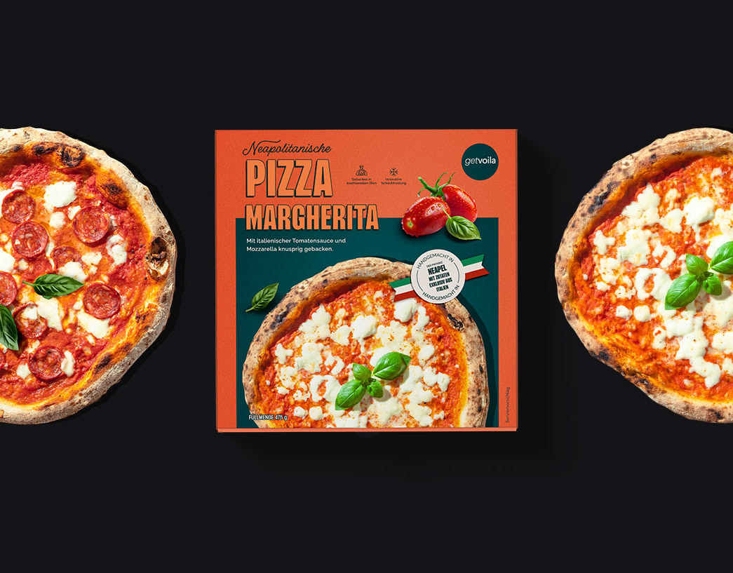
I worked on the branding for getvoila's sub-brand plates: fresh frozen dishes ready in just 10 min. These premium, restaurant-quality frozen meals aim to make top-class cuisine become accessible to everyone.
After an engaging workshop with my team, I was given the task to translate our vision into two different branding routes.
After an engaging workshop with my team, I was given the task to translate our vision into two different branding routes.
Route 1 vs. Route 2
Route 1
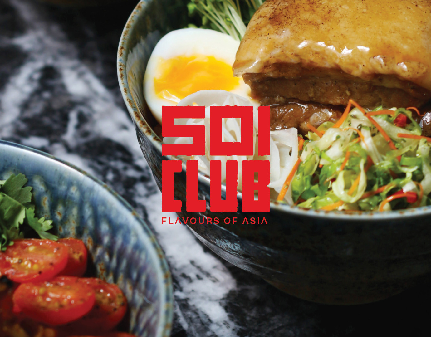
For Route 1 I focused on the younger audience using a more playful approach. I designed a logotype with chunky letters, giving the sense of fun and freshness. Brainstorming on the packaging, I came up with a veggie tone-on-tone pattern and a second option with a stronger, contrasting font pattern.
Route 2
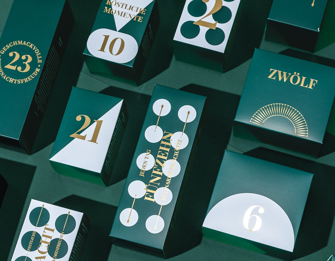
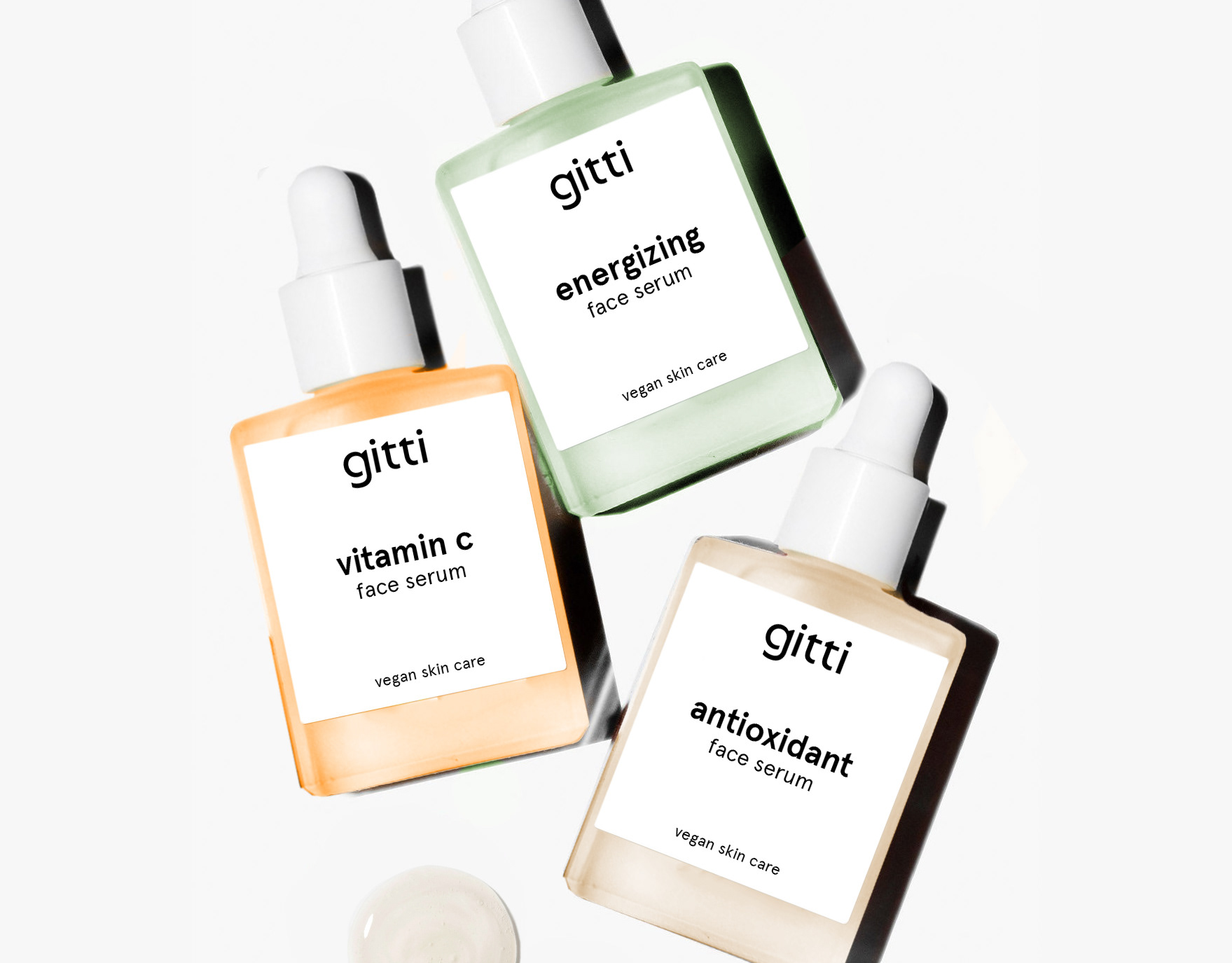
In contrast, Route 2 takes a more commercial direction. The classy logo and the cleaner graphic design speak for timeless elegance, appealing to a broader audience. The packaging is in a contrasting colour-blocking or dressed in a mixed pattern of tone-on-tone shapes, font and hand drawn lines.
© getvoila
